
|
Main Page Class Hierarchy Alphabetical List Compound List File List Compound Members
|
#include <FXCheckButton.h>
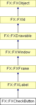
Inheritance diagram for FX::FXCheckButton:
Public Member Functions | |
| FXCheckButton (FXComposite *p, const FXString &text, FXObject *tgt=NULL, FXSelector sel=0, FXuint opts=CHECKBUTTON_NORMAL, FXint x=0, FXint y=0, FXint w=0, FXint h=0, FXint pl=DEFAULT_PAD, FXint pr=DEFAULT_PAD, FXint pt=DEFAULT_PAD, FXint pb=DEFAULT_PAD) | |
| virtual bool | canFocus () const |
| virtual FXint | getDefaultWidth () |
| virtual FXint | getDefaultHeight () |
| void | setCheck (FXbool state=TRUE, FXbool notify=FALSE) |
| FXbool | getCheck () const |
| void | setCheckButtonStyle (FXuint style) |
| FXuint | getCheckButtonStyle () const |
| FXColor | getBoxColor () const |
| void | setBoxColor (FXColor clr) |
| FXColor | getCheckColor () const |
| void | setCheckColor (FXColor clr) |
| virtual void | save (FXStream &store) const |
| virtual void | load (FXStream &store) |
Normally, it is either TRUE or FALSE, and toggles between TRUE or FALSE whenever it is pressed. A third state MAYBE may be set to indicate that no selection has been made yet by the user, or that the state is ambiguous. When pressed, the Check Button sends a SEL_COMMAND to its target, and the message data represents the state of the check button. The option CHECKBUTTON_AUTOGRAY (CHECKBUTTON_AUTOHIDE) causes the button to be grayed out (hidden) if its handler does not respond to the SEL_UPDATE message. With the CHECKBUTTON_PLUS option, the Check Button will draw a + or - sign instead of a check. You can use this to make collapsable panels, by hooking up a Check Button to a layout manager via the ID_TOGGLE_SHOWN message. This will give a similar visual element as collapsing folders in a Tree List.
See also:
|
||||||||||||||||||||||||||||||||||||||||||||||||||||||||
|
Construct new check button.
|
|
|
Returns true because a check button can receive focus.
Reimplemented from FX::FXWindow. |
|
|
Get default width.
Reimplemented from FX::FXLabel. |
|
|
Get default height.
Reimplemented from FX::FXLabel. |
|
||||||||||||
|
Set check button state (TRUE, FALSE or MAYBE).
|
|
|
Get check button state (TRUE, FALSE or MAYBE).
|
|
|
Change check button style.
|
|
|
Return current check button style.
|
|
|
Get the box background color.
|
|
|
Set the box background color.
|
|
|
Get the box check color.
|
|
|
Set the box check color.
|
|
|
Save check button to a stream.
Reimplemented from FX::FXLabel. |
|
|
Load check button from a stream.
Reimplemented from FX::FXLabel. |
|
Copyright © 1997-2005 Jeroen van der Zijp
|